12 Chapter 12: Correlations
Thus far, all of our analyses have focused on comparing the value of a continuous variable across different groups via mean differences. We will now turn away from means and look instead at how to assess the relationship between two continuous variables in the form of correlations. As we will see, the logic behind correlations is the same as it was behind group means, but we will now have the ability to assess an entirely new data structure.
Variability and Covariance
A common theme throughout statistics is the notion that individuals will differ on different characteristics and traits, which we call variance. In inferential statistics and hypothesis testing, our goal is to find systematic reasons for differences and rule out random chance as the cause. By doing this, we are using information on a different variable—which so far has been group membership like in ANOVA—to explain this variance. In correlations, we will instead use a continuous variable to account for the variance.
Because we have two continuous variables, we will have two characteristics or scores on which people will vary. What we want to know is whether people vary on the scores together. That is, as one score changes, does the other score also change in a predictable or consistent way? This notion of variables differing together is called covariance (the prefix co- meaning “together”).
Let’s look at our formula for variance on a single variable:
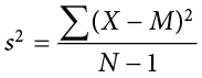
We use X to represent a person’s score on the variable at hand, and  to represent the mean of that variable. The numerator of this formula is the sum of squares, which we have seen several times for various uses. Recall that squaring a value is just multiplying that value by itself. Thus, we can write the same equation as:
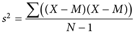
This is the same formula and works the same way as before, where we multiply the deviation score by itself (we square it) and then sum across squared deviations.
Now, let’s look at the formula for covariance. In this formula, we will still use X to represent the score on one variable, and we will now use Y to represent the score on the second variable. We will still use bars to represent averages of the scores. The formula for covariance (covXY with the subscript XY to indicate covariance across the X and Y variables) is:
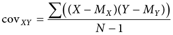
As we can see, this is the exact same structure as the previous formula. Now, instead of multiplying the deviation score by itself on one variable, we take the deviation scores from a single person on each variable and multiply them together. We do this for each person (exactly the same as we did for variance) and then sum them to get our numerator. The numerator in this is called the sum of products.
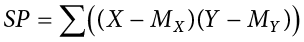
We will calculate the sum of products using the same table we used to calculate the sum of squares. In fact, the table for sum of products is simply a sum of squares table for X, plus a sum of squares table for Y, with a final column of products, as shown below.
|
X |
(X − MX) |
(X − MX)2 |
Y |
(Y − MY) |
(Y − MY)2 |
(X − MX)(Y − MY) |
This table works the same way it did before (remember that the column headers tell you exactly what to do in that column). We list our raw data for the X and Y variables in the X and Y columns, respectively, then add them up so we can calculate the mean of each variable. We then take those means and subtract them from the appropriate raw score to get our deviation scores for each person on each variable, and the columns of deviation scores will both add up to zero. We will square our deviation scores for each variable to get the sums of squares for X and Y so that we can compute the variance and standard deviation of each. (We will use the standard deviation in our equation below.) Finally, we take the deviation score from each variable and multiply them together to get our product score. Summing this column will give us our sum of products. It is very important that you multiply the raw deviation scores from each variable, not the squared deviation scores.
Our sum of products will go into the numerator of our formula for covariance, and then we only have to divide by N − 1 to get our covariance. Unlike the sum of squares, both our sum of products and our covariance can be positive, negative, or zero, and they will always match (e.g., if our sum of products is positive, our covariance will always be positive). A positive sum of products and covariance indicates that the two variables are related and move in the same direction. That is, as one variable goes up, the other will also go up, and vice versa. A negative sum of products and covariance means that the variables are related but move in opposite directions when they change, which is called an inverse relationship. In an inverse relationship, as one variable goes up, the other variable goes down. If the sum of products and covariance are zero, then that means the variables are not related. As one variable goes up or down, the other variable does not change in a consistent or predictable way.
The previous paragraph brings us to an important definition about relationships between variables. What we are looking for in a relationship is a consistent or predictable pattern. That is, the variables change together, either in the same direction or opposite directions, in the same way each time. It doesn’t matter if this relationship is positive or negative, only that it is not zero. If there is no consistency in how the variables change within a person, then the relationship is zero and does not exist. We will revisit this notion of direction vs. zero relationship later on.
Visualizing Relationships
Chapter 2 covered many different forms of data visualization, and visualizing data remains an important first step in understanding and describing our data before we move into inferential statistics. Nowhere is this more important than in correlation. Correlations are visualized by a scatter plot, where our X variable values are plotted on the x-axis, the Y variable values are plotted on the y-axis, and each point or marker in the plot represents a single person’s score on X and Y. Figure 12.1 shows a scatter plot for hypothetical scores on job satisfaction (X) and worker well-being (Y). We can see from the axes that each of these variables is measured on a 10-point scale, with 10 being the highest on both variables (high satisfaction and good well-being) and 1 being the lowest (dissatisfaction and poor well-being). When we look at this plot, we can see that the variables do seem to be related. The higher scores on job satisfaction tend to also be the higher scores on well-being, and the same is true of the lower scores.
Figure 12.1. Plotting job satisfaction and well-being scores. (“Scatter Plot Job Satisfaction and Well-Being” by Judy Schmitt is licensed under CC BY-NC-SA 4.0.)
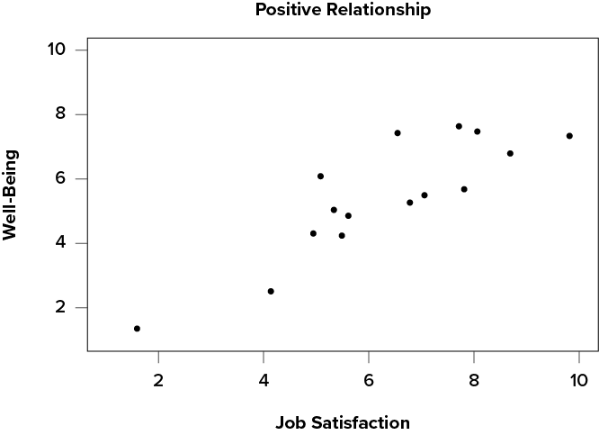
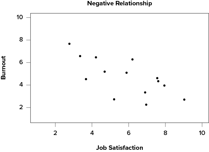
Figure 12.1 demonstrates a positive relationship. As scores on X increase, scores on Y also tend to increase. Although this is not a perfect relationship (if it were, the points would form a single straight line), it is nonetheless very clearly positive. This is one of the key benefits to scatter plots: they make it very easy to see the direction of the relationship. As another example, Figure 12.2 shows a negative relationship between job satisfaction (X) and burnout (Y). As we can see from this plot, higher scores on job satisfaction tend to correspond with lower scores on burnout, which is how stressed, unenergetic, and unhappy someone is at their job. As with Figure 12.1, this is not a perfect relationship, but it is still a clear one. As these figures show, points in a positive relationship move from the bottom left of the plot to the top right, and points in a negative relationship move from the top left to the bottom right.
Figure 12.2. Plotting job satisfaction and burnout scores. (“Scatter Plot Job Satisfaction and Burnout” by Judy Schmitt is licensed under CC BY-NC-SA 4.0.)
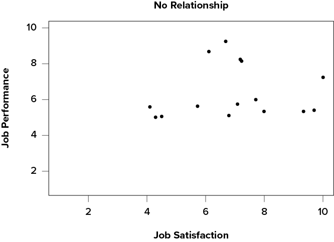
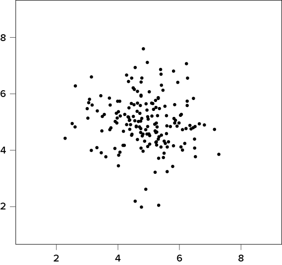
Scatter plots can also indicate that there is no relationship between the two variables. In these scatter plots (for example, Figure 12.3, which plots job satisfaction and job performance) there is no interpretable shape or line in the scatter plot. The points appear randomly throughout the plot. If we tried to draw a straight line through these points, it would basically be flat. The low scores on job satisfaction have roughly the same scores on job performance as do the high scores on job satisfaction. Scores in the middle or average range of job satisfaction have some scores on job performance that are about equal to the high and low levels and some scores on job performance that are a little higher, but the overall picture is one of inconsistency.
Figure 12.3. Plotting no relationship between job satisfaction and job performance. (“Scatter Plot Job Satisfaction and Job Performance” by Judy Schmitt is licensed under CC BY-NC-SA 4.0.)
As we can see, scatter plots are very useful for giving us an approximate idea of whether there is a relationship between the two variables and, if there is, if that relationship is positive or negative. They are also the only way to determine one of the characteristics of correlations that are discussed next: form.
Three Characteristics
When we talk about correlations, there are three traits that we need to know in order to truly understand the relationship (or lack of relationship) between X and Y: form, direction, and magnitude. We will discuss each of them in turn.
Form
The first characteristic of relationships between variables is their form. The form of a relationship is the shape it takes in a scatter plot, and a scatter plot is the only way it is possible to assess the form of a relationship. There are three forms we look for: linear, curvilinear, or no relationship. A linear relationship is what we saw in Figure 12.1, Figure 12.2, and Figure 12.3. If we drew a line through the middle points in any of the scatter plots, we would be best suited with a straight line. The term linear comes from the word line. A linear relationship is what we will always assume when we calculate correlations. All of the correlations presented here are only valid for linear relationships. Thus, it is important to plot our data to make sure we meet this assumption.
The relationship between two variables can also be curvilinear. As the name suggests, a curvilinear relationship is one in which a line through the middle of the points in a scatter plot will be curved rather than straight. Two examples are presented in Figure 12.4 and Figure 12.5.
Figure 12.4. Exponentially increasing curvilinear relationship. (“Curvilinear Relation Increasing” by Judy Schmitt is licensed under CC BY-NC-SA 4.0.)
Figure 12.5. Inverted-U curvilinear relationship. (“Curvilinear Relation Inverted U” by Judy Schmitt is licensed under CC BY-NC-SA 4.0.)
Curvilinear relationships can take many shapes, and the two examples above are only a small sample of the possibilities. What they have in common is that they both have a very clear pattern but that pattern is not a straight line. If we try to draw a straight line through them, we would get a result similar to what is shown in Figure 12.6.
Figure 12.6. Overlaying a straight line on a curvilinear relationship. (“Curvilinear Relation Inverted U with Straight Line” by Judy Schmitt is licensed under CC BY-NC-SA 4.0.)
Although that line is the closest it can be to all points at the same time, it clearly does a very poor job of representing the relationship we see. Additionally, the line itself is flat, suggesting there is no relationship between the two variables even though the data show that there is one. This is important to keep in mind, because the math behind our calculations of correlation coefficients will only ever produce a straight line—we cannot create a curved line with the techniques discussed here.
Finally, sometimes when we create a scatter plot, we end up with no interpretable relationship at all. An example of this is shown in Figure 12.7. The points in this plot show no consistency in relationship, and a line through the middle would once again be a straight, flat line.
Figure 12.7. No relationship. (“Scatter Plot No Relation” by Judy Schmitt is licensed under CC BY-NC-SA 4.0.)
Sometimes when we look at scatter plots, it is tempting to get biased by a few points that fall far away from the rest of the points and seem to imply that there may be some sort of relationship. These points are called outliers, and we will discuss them in more detail later in the chapter. These can be common, so it is important to formally test for a relationship between our variables, not just rely on visualization. This is the point of hypothesis testing with correlations, and we will go in-depth on it soon. First, however, we need to describe the other two characteristics of relationships: direction and magnitude.
Direction
The direction of the relationship between two variables tells us whether the variables change in the same way at the same time or in opposite ways at the same time. We saw this concept earlier when first discussing scatter plots, and we used the terms positive and negative. A positive relationship is one in which X and Y change in the same direction: as X goes up, Y goes up, and as X goes down, Y also goes down. A negative relationship is just the opposite: X and Y change together in opposite directions: as X goes up, Y goes down, and vice versa.
As we will see soon, when we calculate a correlation coefficient, we are quantifying the relationship demonstrated in a scatter plot. That is, we are putting a number to it. That number will be either positive, negative, or zero, and we interpret the sign of the number as our direction. If the number is positive, it is a positive relationship, and if it is negative, it is a negative relationship. If it is zero, then there is no relationship. The direction of the relationship corresponds directly to the slope of the hypothetical line we draw through scatter plots when assessing the form of the relationship. If the line has a positive slope that moves from bottom left to top right, it is positive, and vice versa for negative. If the line it flat, that means it has no slope, and there is no relationship, which will in turn yield a zero for our correlation coefficient.
Magnitude
The number we calculate for our correlation coefficient, which we will describe in detail below, corresponds to the magnitude of the relationship between the two variables. The magnitude is how strong or how consistent the relationship between the variables is. Higher numbers mean greater magnitude, which means a stronger relationship.
Our correlation coefficients will take on any value between −1.00 and 1.00, with 0.00 in the middle, which again represents no relationship. A correlation of −1.00 is a perfect negative relationship; as X goes up by some amount, Y goes down by the same amount, consistently. Likewise, a correlation of 1.00 indicates a perfect positive relationship; as X goes up by some amount, Y also goes up by the same amount. Finally, a correlation of 0.00, which indicates no relationship, means that as X goes up by some amount, Y may or may not change by any amount, and it does so inconsistently.
The vast majority of correlations do not reach −1.00 or 1.00. Instead, they fall in between, and we use rough cut offs for how strong the relationship is based on this number. Importantly, the sign of the number (the direction of the relationship) has no bearing on how strong the relationship is. The only thing that matters is the magnitude, or the absolute value of the correlation coefficient. A correlation of −1 is just as strong as a correlation of 1. We generally use values of .10, .30, and .50 as indicating weak, moderate, and strong relationships, respectively.
The strength of a relationship, just like the form and direction, can also be inferred from a scatter plot, though this is much more difficult to do. Some examples of weak and strong relationships are shown in Figure 12.8 and Figure 12.9, respectively. Weak correlations still have an interpretable form and direction, but it is much harder to see. Strong correlations have a very clear pattern, and the points tend to form a line. The examples show two different directions, but remember that the direction does not matter for the strength, only the consistency of the relationship and the size of the number, which we will see next.
Figure 12.8. Weak positive correlation. (“Scatter Plot Weak Positive Correlation” by Judy Schmitt is licensed under CC BY-NC-SA 4.0.)
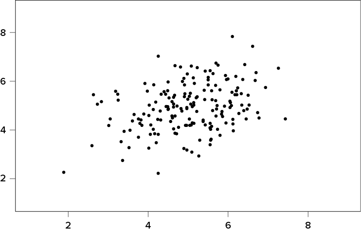
Figure 12.9. Strong negative correlation. (“Scatter Plot Strong Negative Correlation” by Judy Schmitt is licensed under CC BY-NC-SA 4.0.)
Pearson’s r
There are several different types of correlation coefficients, but we will only focus on Pearson’s r, the most popular correlation coefficient for assessing linear relationships, which serves as both a descriptive statistic (like ) and a test statistic (like t). It is descriptive because it describes what is happening in the scatter plot; r will have both a sign (+/−) for the direction and a number (0 to 1 in absolute value) for the magnitude. As noted above, because it assumes a linear relationship, nothing about r will suggest what the form is—it will only tell what the direction and magnitude will be if the form is linear. (Remember: always make a scatter plot first!) The coefficient r also works as a test statistic because the magnitude of r will correspond directly to a t value as the specific degrees of freedom, which can then be compared to a critical value. Luckily, we do not need to do this conversion by hand. Instead, we will have a table of r critical values that looks very similar to our t table, and we can compare our r directly to those.
The formula for r is very simple: it is just the covariance (defined above) divided by the standard deviations of X and Y:
The first formula gives a direct sense of what a correlation is: a covariance standardized onto the scale of X and Y; the second formula is computationally simpler and faster. Both of these equations will give the same value, and as we saw at the beginning of the chapter, all of these values are easily computed by using the sum of products table. When we do this calculation, we will find that our answer is always between −1.00 and 1.00 (if it’s not, check the math again), which gives us a standard, interpretable metric, similar to what z scores did.
It was stated earlier that r is a descriptive statistic like , and just like , it corresponds to a population parameter. For correlations, the population parameter is the lowercase Greek letter  (“rho”); be careful not to confuse with a p value—they look quite similar. The statistic r is an estimate of , just as is an estimate of
  . Thus, we will test our observed value of r that we calculate from the data and compare it to a value of specified by our null hypothesis to see if the relationship between our variables is significant, as we will see in the following example.
Example Anxiety and Depression
Anxiety and depression are often reported to be highly linked (or “comorbid”). Our hypothesis testing procedure follows the same four-step process as before, starting with our null and alternative hypotheses. We will look for a positive relationship between our variables among a group of 10 people because that is what we would expect based on them being comorbid.
Step 1: State the Hypotheses
Our hypotheses for correlations start with a baseline assumption of no relationship, and our alternative will be directional if we expect to find a specific type of relationship. For this example, we expect a positive relationship:
Remember that (“rho”) is our population parameter for the correlation that we estimate with r, just like and for means. Remember also that if there is no relationship between variables, the magnitude will be 0, which is where we get the null and alternative hypothesis values.
Step 2: Find the Critical Values
The critical values for correlations come from the correlation table (a portion of which appears in Table 12.1), which looks very similar to the t table. (The complete correlation table can be found in Appendix D.) Just like our t table, the column of critical values is based on our significance level ( ) and the directionality of our test. The row is determined by our degrees of freedom. For correlations, we have N − 2 degrees of freedom, rather than N − 1 (why this is the case is not important). For our example, we have 10 people, so our degrees of freedom = 10 − 2 = 8.
Table 12.1. Critical Values for Pearson’s r (Correlation Table)
|
|
Level of Significance for One-Tailed Test |
|||
|
.05 |
.025 |
.01 |
.005 |
|
|
Level of Significance for Two-Tailed Test |
||||
|
.10 |
.05 |
.02 |
.01 |
|
|
1 |
.988 |
.997 |
.9995 |
.9999 |
|
2 |
.900 |
.950 |
.980 |
.990 |
|
3 |
.805 |
.878 |
.934 |
.959 |
|
4 |
.729 |
.811 |
.882 |
.917 |
|
5 |
.669 |
.754 |
.833 |
.875 |
|
6 |
.621 |
.707 |
.789 |
.834 |
|
7 |
.582 |
.666 |
.750 |
.798 |
|
8 |
.549 |
.632 |
.715 |
.765 |
|
9 |
.521 |
.602 |
.685 |
.735 |
|
10 |
.497 |
.576 |
.658 |
.708 |
|
11 |
.476 |
.553 |
.634 |
.684 |
|
12 |
.458 |
.532 |
.612 |
.661 |
|
13 |
.441 |
.514 |
.592 |
.641 |
|
14 |
.426 |
.497 |
.574 |
.623 |
|
15 |
.412 |
.482 |
.558 |
.606 |

We were not given any information about the level of significance at which we should test our hypothesis, so we will assume a = .05 as always. From our table, we can see that a one-tailed test (because we expect only a positive relationship) at the a = .05 level has a critical value of r* = .549. Thus, if our observed correlation is greater than .549, it will be statistically significant. This is a rather high bar (remember, the guideline for a strong relationship is r = .50); this is because we have so few people. Larger samples make it easier to find significant relationships.
Step 3: Calculate the Test Statistic and Effect Size
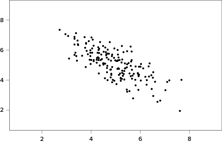
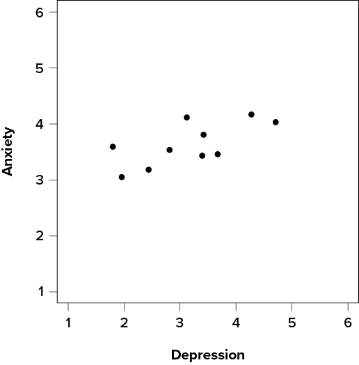
We have laid out our hypotheses and the criteria we will use to assess them, so now we can move on to our test statistic. Before we do that, we must first create a scatter plot of the data to make sure that the most likely form of our relationship is in fact linear. Figure 12.10 shows our data plotted out, and it looks like they are, in fact, linearly related, so Pearson’s r is appropriate.
Figure 12.10. Scatter plot of depression and anxiety. (“Scatter Plot Depression and Anxiety” by Judy Schmitt is licensed under CC BY-NC-SA 4.0.)
The data we gather from our participants is as follows:
|
Dep. |
2.81 |
1.96 |
3.43 |
3.40 |
4.71 |
1.80 |
4.27 |
3.68 |
2.44 |
3.13 |
|
Anx. |
3.54 |
3.05 |
3.81 |
3.43 |
4.03 |
3.59 |
4.17 |
3.46 |
3.19 |
4.12 |
We will need to put these values into our sum of products table to calculate the standard deviation and covariance of our variables. We will use X for depression and Y for anxiety to keep track of our data, but be aware that this choice is arbitrary and the math will work out the same if we decided to do the opposite. Our table is thus:
|
X |
(X − MX) |
(X − MX)2 |
Y |
(Y − MY) |
(Y − MY)2 |
(X − MX)(Y − MY) |
|
2.81 |
−0.35 |
0.12 |
3.54 |
−0.10 |
0.01 |
0.04 |
|
1.96 |
−1.20 |
1.44 |
3.05 |
−0.59 |
0.35 |
0.71 |
|
3.43 |
0.27 |
0.07 |
3.81 |
0.17 |
0.03 |
0.05 |
|
3.40 |
0.24 |
0.06 |
3.43 |
−0.21 |
0.04 |
−0.05 |
|
4.71 |
1.55 |
2.40 |
4.03 |
0.39 |
0.15 |
0.60 |
|
1.80 |
−1.36 |
1.85 |
3.59 |
−0.05 |
0.00 |
0.07 |
|
4.27 |
1.11 |
1.23 |
4.17 |
0.53 |
0.28 |
0.59 |
|
3.68 |
0.52 |
0.27 |
3.46 |
−0.18 |
0.03 |
−0.09 |
|
2.44 |
−0.72 |
0.52 |
3.19 |
−0.45 |
0.20 |
0.32 |
|
3.13 |
−0.03 |
0.00 |
4.12 |
0.48 |
0.23 |
−0.01 |
|
31.63 |
0.03 |
7.97 |
36.39 |
−0.01 |
1.33 |
2.22 |
The bottom row is the sum of each column. We can see from this that the sum of the X observations is 31.63, which makes the mean of the X variable M = 3.16. The deviation scores for X sum to 0.03, which is very close to 0, given rounding error, so everything looks right so far. The next column is the squared deviations for X, so we can see that the sum of squares for X is SSX = 7.97. The same is true of the Y columns, with an average of  = 3.64, deviations that sum to zero within rounding error, and a sum of squares as SSY = 1.33. The final column is the product of our deviation scores (not of our squared deviations), which gives us a sum of products of SP = 2.22.
There are now three pieces of information we need to calculate before we compute our correlation coefficient: the covariance of X and Y and the standard deviation of each.
The covariance of two variables, remember, is the sum of products divided by N − 1. For our data:
The formulas for standard deviation are the same as before. Using subscripts X and Y to denote depression and anxiety:
Now we have all of the information we need to calculate r:
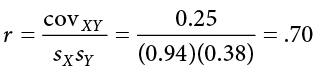
We can verify this using our other formula, which is computationally shorter:
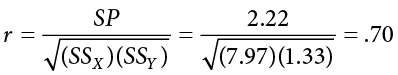
So our observed correlation between anxiety and depression is r = .70, which, based on sign and magnitude, is a strong, positive correlation. Now we need to compare it to our critical value to see if it is also statistically significant.
Effect Size and Pearson’s r
Pearson’s r is an incredibly flexible and useful statistic. Not only is it both descriptive and inferential, as we saw above, but because it is on a standardized metric (always between −1.00 and 1.00), it can also serve as its own effect size. In general, we use r = .10, r = .30, and r = .50 as our guidelines for small, medium, and large effects. Just like with Cohen’s d, these guidelines are not absolutes, but they do serve as useful indicators in most situations. Notice as well that these are the same guidelines we used earlier to interpret the magnitude of the relationship based on the correlation coefficient.
In addition to r being its own effect size, there is an additional effect size we can calculate for our results. This effect size is r2, and it is exactly what it looks like—it is the squared value of our correlation coefficient. Just like h2 in ANOVA, r2 is interpreted as the amount of variance explained in the outcome variance, and the cut scores are the same as well: .01, .09, and .25 for small, medium, and large, respectively. Notice here that these are the same cutoffs we used for regular r effect sizes, but squared (.102 = .01, .302 = .09, .502 = .25) because, again, the r2 effect size is just the squared correlation, so its interpretation should be, and is, the same. The reason we use r2 as an effect size is because our ability to explain variance is often important to us.
The similarities between h2 and r2 in interpretation and magnitude should clue you in to the fact that they are similar analyses, even if they look nothing alike. That is because, behind the scenes, they actually are! In Chapter 13, we will learn a technique called linear regression, which will formally link the two analyses together.
Step 4: Make a Decision
Our critical value was r* = .549 and our obtained value was r = .70. Our obtained value was larger than our critical value, so we can reject the null hypothesis.
Reject H0. Based on our sample of 10 people, there is a statistically significant, strong, positive relationship between anxiety and depression, r(8) = .70, p < .05.
Notice in our interpretation that, because we already know the magnitude and direction of our correlation, we can interpret that. We also report the degrees of freedom, just like with t, and we know that p < a because we rejected the null hypothesis. As we can see, even though we are dealing with a very different type of data, our process of hypothesis testing has remained unchanged. Unlike for our other statistics, we do not report an effect size for the correlation coefficient because the reader can easily do that for themselves, by squaring r. The r2 statistic is called the coefficient of determination and is essentially effect size for a correlation coefficient; it tells us what percentage of the variance in the X variable is explained by the Y variable (and vice versa).
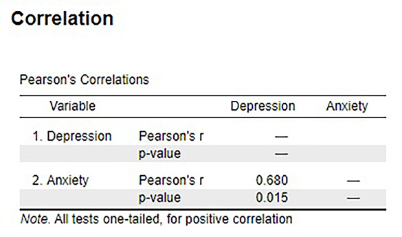
Figure 12.11 shows the output from JASP for this example.
Figure 12.11. Output from JASP for the correlation described in the Anxiety and Depression example. The output provides the Pearson’s r (.68; note the value provided in text using hand calculations is .70 due to rounding), and the exact p value (.015, which is less than .05). Based on our sample of 10 people, there is a statistically significant, strong, positive relationship between anxiety and depression, r(8) = .68, p = .015. (“JASP correlation” by Rupa G. Gordon/Judy Schmitt is licensed under CC BY-NC-SA 4.0.)
Correlation versus Causation
We cover a great deal of material in introductory statistics and, as mentioned Chapter 1, many of the principles underlying what we do in statistics can be used in your day-to-day life to help you interpret information objectively and make better decisions. We now come to what may be the most important lesson in introductory statistics: the difference between correlation and causation.
It is very, very tempting to look at variables that are correlated and assume that this means they are causally related; that is, it gives the impression that X is causing Y. However, in reality, correlations do not—and cannot—do this. Correlations do not prove causation. No matter how logical or how obvious or how convenient it may seem, no correlational analysis can demonstrate causality. The only way to demonstrate a causal relationship is with a properly designed and controlled experiment.
Many times, we have good reason for assessing the correlation between two variables, and often that reason will be that we suspect one causes the other. Thus, when we run our analyses and find strong, statistically significant results, it is tempting to say that we found the causal relationship that we are looking for. The reason we cannot do this is that, without an experimental design that includes random assignment and control variables, the relationship we observe between the two variables may be caused by something else that we failed to measure—something we can only detect and control for with an experiment. These confound variables, which we will represent with Z, can cause two variables X and Y to appear related when in fact they are not. They do this by being the hidden—or lurking—cause of each variable independently. That is, if Z causes X and Z causes Y, the X and Y will appear to be related. However, if we control for the effect of Z (the method for doing this is beyond the scope of this text), then the relationship between X and Y will disappear.
A popular example of this effect is the correlation between ice cream sales and deaths by drowning. These variables are known to correlate very strongly over time. However, this does not prove that one causes the other. The lurking variable in this case is the weather—people enjoy swimming and enjoy eating ice cream more during hot weather as a way to cool off. As another example, consider shoe size and spelling ability in elementary school children. Although there should clearly be no causal relationship here, the variables are nonetheless consistently correlated. The confound in this case? Age. Older children spell better than younger children and are also bigger, so they have larger shoes.
When there is the possibility of confounding variables being the hidden cause of our observed correlation, we will often collect data on Z as well and control for it in our analysis. This is good practice and a wise thing for researchers to do. Thus, it would seem that it is easy to demonstrate causation with a correlation that controls for Z. However, the number of variables that could potentially cause a correlation between X and Y is functionally limitless, so it would be impossible to control for everything. That is why we use experimental designs; by randomly assigning people to groups and manipulating variables in those groups, we can balance out individual differences in any variable that may be our cause.
It is not always possible to do an experiment, however, so there are certain situations in which we will have to be satisfied with our observed relationship and do the best we can to control for known confounds. However, in these situations, even if we do an excellent job of controlling for many extraneous (a statistical and research term for “outside”) variables, we must be careful not to use causal language. That is because, even after controls, sometimes variables are related just by chance.
Sometimes, variables will end up being related simply due to random chance, and we call these correlations spurious. Spurious just means random, so what we are seeing is random correlations because, given enough time, enough variables, and enough data, sampling error will eventually cause some variables to appear related when they are not. Sometimes, this even results in incredibly strong, but completely nonsensical, correlations. This becomes more and more of a problem as our ability to collect massive datasets and dig through them improves, so it is very important to think critically about any relationship you encounter.
Final Considerations
Correlations, although simple to calculate, can be very complex, and there are many additional issues we should consider. We will look at two of the most common issues that affect our correlations and discuss some other correlations and reporting methods you may encounter.
Range Restriction
The strength of a correlation depends on how much variability is in each of the variables X and Y. This is evident in the formula for Pearson’s r, which uses both covariance (based on the sum of products, which comes from deviation scores) and the standard deviation of both variables (based on the sums of squares, which also come from deviation scores). Thus, if we reduce the amount of variability in one or both variables, our correlation will go down. Failure to capture the full range of a variability is called range restriction.
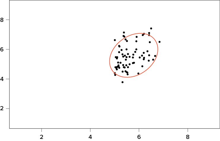
Take a look at Figure 12.12 and Figure 12.13. Figure 12.12 shows a strong relationship (r = .67) between two variables. An orange oval is overlaid on it to make the relationship even more distinct. Figure 12.13 shows the same data, but the bottom half of the X variable (all scores below 5) have been removed, which causes our relationship (again represented by an orange oval) to become much weaker (r = .38). Thus range restriction has truncated (made smaller) our observed correlation.
Figure 12.12. Strong positive correlation. (“Scatter Plot Strong Positive Correlation” by Judy Schmitt is licensed under CC BY-NC-SA 4.0.)
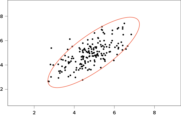
Figure 12.13. Effect of range restriction. (“Scatter Plot Effect of Range Restriction” by Judy Schmitt is licensed under CC BY-NC-SA 4.0.)
Sometimes range restriction happens by design. For example, we rarely hire people who do poorly on job applications, so we would not have the lower range of those predictor variables. Other times, we inadvertently cause range restriction by not properly sampling our population. Although there are ways to correct for range restriction, they are complicated and require much information that may not be known, so it is best to be very careful during the data collection process to avoid it.
Outliers
Another issue that can cause the observed size of our correlation to be inappropriately large or small is the presence of outliers. An outlier is a data point that falls far away from the rest of the observations in the dataset. Sometimes outliers are the result of incorrect data entry, poor or intentionally misleading responses, or simple random chance. Other times, however, they represent real people with meaningful values on our variables. The distinction between meaningful and accidental outliers is a difficult one that is based on the expert judgment of the researcher. Sometimes, we will remove the outlier (if we think it is an accident) or we may decide to keep it (if we find the scores to still be meaningful even though they are different).
The scatter plots in Figure 12.14 show the effects that an outlier can have on data. In the first plot, we have our raw dataset. You can see in the upper right corner that there is an outlier observation that is very far from the rest of our observations on both the X and Y variables. In the middle plot, we see the correlation computed when we include the outlier, along with a straight line representing the relationship; here, it is a positive relationship. In the third plot, we see the correlation after removing the outlier, along with a line showing the direction once again. Not only did the correlation get stronger, it completely changed direction!
Figure 12.14. Three scatter plots showing correlations with and without outliers. (“Scatter Plot Correlations and Outliers” by Judy Schmitt is licensed under CC BY-NC-SA 4.0.)
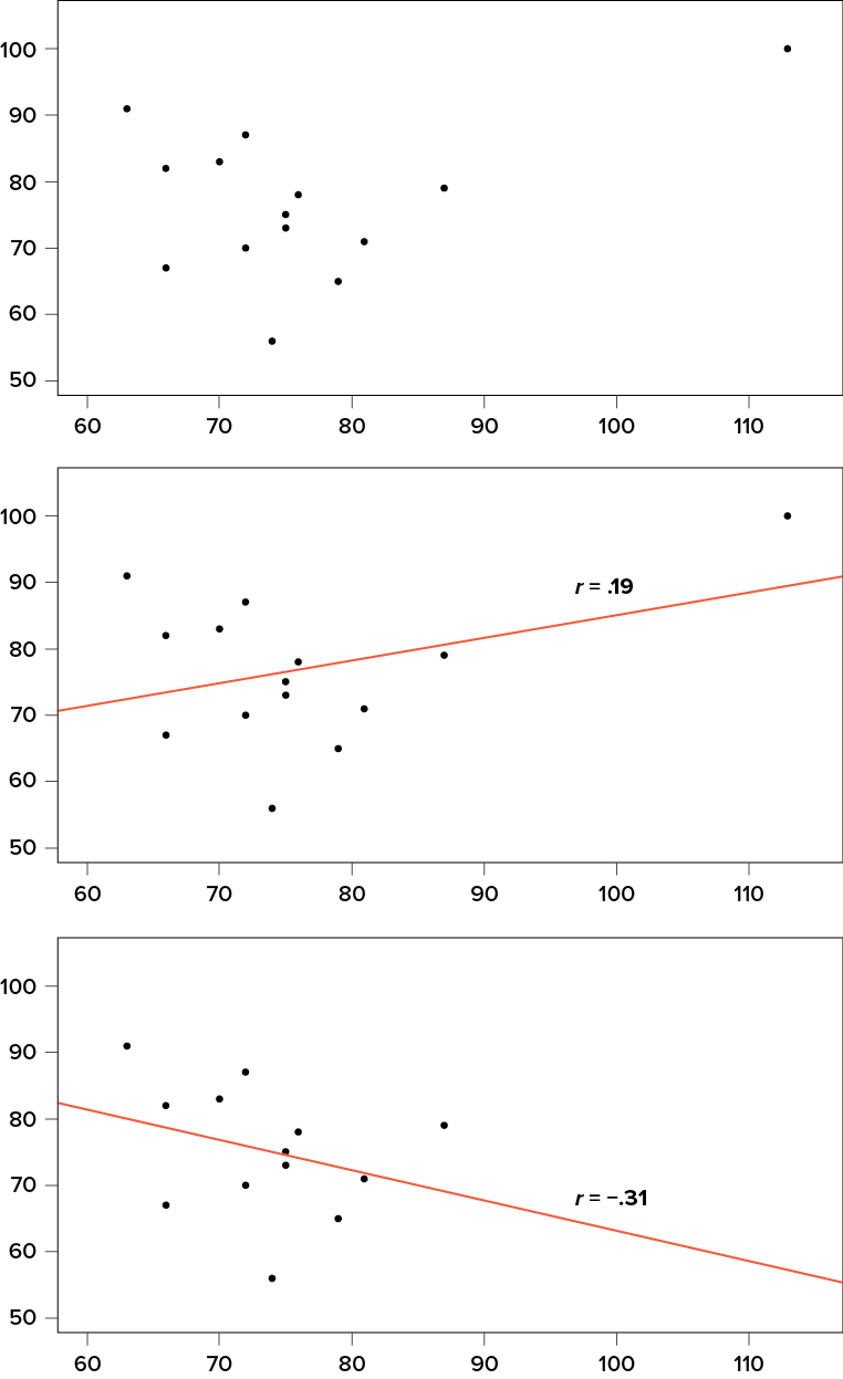
In general, there are three effects that an outlier can have on a correlation: it can change the magnitude (make it stronger or weaker), it can change the significance (make a non-significant correlation significant or vice versa), and/or it can change the direction (make a positive relationship negative or vice versa). Outliers are a big issue in small datasets where a single observation can have a strong weight compared with the rest. However, as our sample sizes get very large (into the hundreds), the effects of outliers diminish because they are outweighed by the rest of the data. Nevertheless, no matter how large a dataset you have, it is always a good idea to screen for outliers, both statistically (using analyses that we do not cover here) and visually (using scatter plots).
Other Correlation Coefficients
In this chapter we have focused on Pearson’s r as our correlation coefficient because it is very common and useful. There are, however, many other correlations out there, each of which is designed for a different type of data. The most common of these is Spearman’s rho (), which is designed to be used on ordinal data rather than continuous data. This is a useful analysis if we have ranked data or our data do not conform to the normal distribution. There are even more correlations for ordered categories, but they are much less common and beyond the scope of this chapter.
Additionally, the principles of correlations underlie many other advanced analyses. In Chapter 13, we will learn about regression, which is a formal way of running and analyzing a correlation that can be extended to more than two variables. Regression is a powerful technique that serves as the basis for even our most advanced statistical models, so what we have learned in this chapter will open the door to an entire world of possibilities in data analysis.
Correlation Matrices
Many research studies look at the relationship between more than two continuous variables. In such situations, we could simply list all of our correlations, but that would take up a lot of space and make it difficult to quickly find the relationship we are looking for. Instead, we create correlation matrices so that we can quickly and simply display our results. A matrix is like a grid that contains our values. There is one row and one column for each of our variables, and the intersections of the rows and columns for different variables contain the correlation for those two variables.
At the beginning of the chapter, we saw scatter plots presenting data for correlations between job satisfaction, well-being, burnout, and job performance. We can create a correlation matrix to quickly display the numerical values of each. Such a matrix is shown below.
|
Satisfaction |
Well-being |
Burnout |
Performance |
|
|
Satisfaction |
1.00 |
|||
|
Well-being |
0.41 |
1.00 |
||
|
Burnout |
−0.54 |
−0.87 |
1.00 |
|
|
Performance |
0.08 |
0.21 |
−0.33 |
1.00 |
Notice that there are values of 1.00 where each row and column of the same variable intersect. This is because a variable correlates perfectly with itself, so the value is always exactly 1.00. Also notice that the upper cells are left blank and only the cells below the diagonal of 1.00s are filled in. This is because correlation matrices are symmetrical: they have the same values above the diagonal as below it. Filling in both sides would provide redundant information and make it a bit harder to read the matrix, so we leave the upper triangle blank.
Correlation matrices are a very condensed way of presenting many results quickly, so they appear in almost all research studies that use continuous variables. Many matrices also include columns that show the variable means and standard deviations, as well as asterisks showing whether or not each correlation is statistically significant.
Exercises
- What does a correlation assess?
- What are the three characteristics of a correlation coefficient?
- What is the difference between covariance and correlation?
- Why is it important to visualize correlational data in a scatter plot before performing analyses?
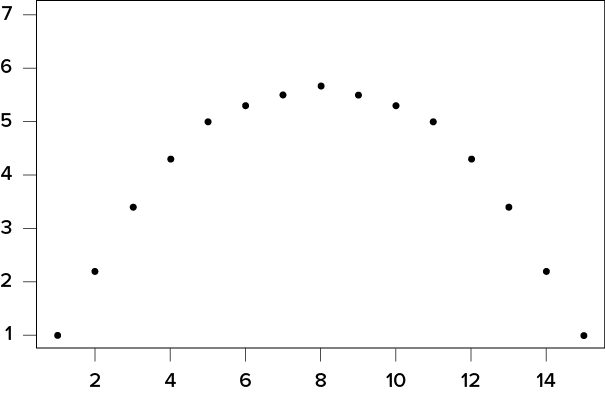
- What sort of relationship is displayed in the scatter plot below?
(“Scatter Plot in Exercises” by Judy Schmitt is licensed under CC BY-NC-SA 4.0.)
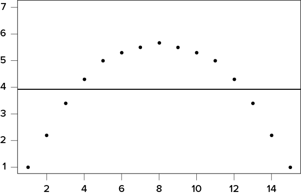
- What sort of relationship is displayed in the scatter plot below?
- What is the direction and magnitude of the following correlation coefficients?
- −.81
- .40
- .15
- −.08
- .29
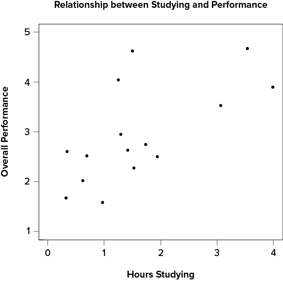
- Create a scatter plot from the following data:
Hours Studying
Overall Class Performance
0.62
2.02
1.50
4.62
0.34
2.60
0.97
1.59
3.54
4.67
0.69
2.52
1.53
2.28
0.32
1.68
1.94
2.50
1.25
4.04
1.42
2.63
3.07
3.53
3.99
3.90
1.73
2.75
1.29
2.95
- In the following correlation matrix, what is the relationship (number, direction, and magnitude) between
- Pay and Satisfaction
- Stress and Health
Workplace
Pay
Satisfaction
Stress
Health
Pay
1.00
Satisfaction
.68
1.00
Stress
.02
−.23
1.00
Health
.05
.15
−.48
1.00
- Using the data from Problem 7, test for a statistically significant relationship between the variables.
- Researchers investigated mother-infant vocalizations in several cultures to determine the extent to which such vocal interactions are true for all humans or culture-specific. They thought that mothers who talked more would have babies who vocalized (babbled) more. They observed mothers and infants for 50 minutes and recorded the number of times the mother spoke and the baby vocalized during the observation session. Data below are for 10 mother-infant pairs in Cameroon. Test the hypothesis at the a = .05 level using the four-step hypothesis testing procedure.
Mother Spoke
Baby Vocalized
80
110
60
110
120
100
100
130
100
140
90
115
80
150
40
130
80
95
50
50
Answers to Odd-Numbered Exercises
1)
Correlations assess the linear relationship between two continuous variables.
3)
Covariance is an unstandardized measure of how related two continuous variables are. Correlations are standardized versions of covariance that fall between −1.00 and 1.00.
5)
Strong, positive, linear relationship
7)
Your scatter plot should look similar to this:
9)
(“Scatter Plot Studying and Performance” by Judy Schmitt is licensed under CC BY-NC-SA 4.0.)
Step 1: H0: r = 0 “There is no relationship between time spent studying and overall performance in class,” HA: r > 0 “There is a positive relationship between time spent studying and overall performance in class.”
Step 2: df = 15 − 2 = 13, a = .05, one-tailed test, r* = .441
Step 3: Using the sum of products table, you should find:  = 1.61, SSX = 17.44, = 2.95, SSY = 13.60, SP = 10.06, r = .65
Step 4: Obtained statistic is greater than critical value, reject H0. There is a statistically significant, strong, positive relationship between time spent studying and performance in class, r(13) = .65, p < .05.
